Where We Started
A need for rebranding to update the look and feel of Baronet Coffee for the convenience store audience.
Where We Finished
Baronet Coffee has a fresh, focused identity that speaks to their heritage and to the quality of their coffee. They are poised to compete more effectively in the convenience store arena by appealing to a more sophisticated coffee drinker. They are now also positioned strongly to compete with other coffee giants in their industry.
How We Got There
We tasted coffee. We knew that the world of coffee was cluttered with small coffee suppliers as well as large retailers with all types of coffee offerings. We had to know what distinguished Baronet from its field of competitors. We met with the company’s owner and talked about the importance of Baronet’s three-generation company history. We also learned that Baronet Coffee offers a richer coffee blend than many in the marketplace. So we decided that their new identity had to embrace both of these aspects.
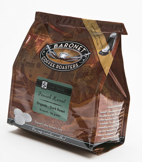
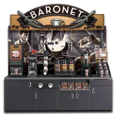
With our designer, we developed the new look and feel of the brand. Then we worked with an illustrator who brought Baronet’s heritage-driven, authentic logo to life through original wood cut illustration. The color palette of rich browns that were chosen drives the rich coffee message of the product home to the consumer. As a result, Baronet has a cohesive presentation for the c-store audience as well as a brand identity that is a strong competitor at point-of-sale. This new identity communicates the quality of their coffee as well as helping Baronet to widen their distribution possibilities.


