Where We Started
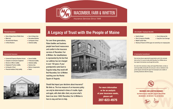
Advice on printing a simple brochure for one of Maine’s oldest and most respected private
insurance agencies.
Where We Finished
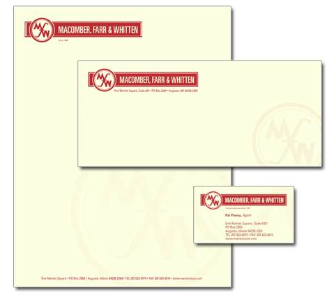
Macomber, Farr & Whitten has its first corporate identity in 150 years of business, with logo, copy and design that reflects upon and reinforces the trust and track record they have built through generations of service to Mainers.
How We Got There
We asked about a logo. When all the printed material MF&W was currently using was collected, we knew they needed a distinctive, coherent look – one that was suitable for a preeminent, highly respected firm. So before printing anything, we went back to basics and created a new identity for them. We asked questions about the brochure’s intended audience, what it should convey and about their lengthy list of insurance products. Then we spent several hours with senior managers to help them define their strengths and vulnerabilities, their position in the Maine insurance market and what impression their printed materials should give about the firm. Creative concept, copy, design and, of course, printing all flowed from there.


